Photo Editor feature for mobile UI at Art.com
Overview
I contracted at Art.com, an arts, poster, and home goods furnishing e-commerce brand, to take on a short-term contract. My key project was to create a new feature on their mobile app that would upload pictures from the customer's phone, do quick edits to the image, and allow the customer to print and frame it for the holiday season. The project was based on a quick turnaround of six weeks from design through prototype to development. I worked closely with a small team of mobile engineers for Android and iOS and one other lead designer.
The feature was successfully shipped before Christmas which allowed the customers to maximize on the company's high profit margin of custom mat and framing of artwork.
Date
August 2018 -January 2019
Role
UX & UI design, working with mobile engineering, icon design
Company
Art.com
Emeryville, CA
Design Process
Project Brief
This project was done at a five month contract while at Art.com, an arts, poster, and home good furnishing e-commerce brand. Their principle design requirement was to create a new photo editor feature on the mobile app that would be successfully shipped by Christmas, which I delivered with their mobile app team for iOS and Android releases of Art.com.
Considerations
Since the majority of profit was made from custom framing, it was important to get the product features delivered during the highest traffic period for the holiday season. I was brought on in September and requested to ship the feature by Thanksgiving. Although I had the design and prototypes ready by then, because of unexpected delays, we didn’t push the feature to mobile until early December.

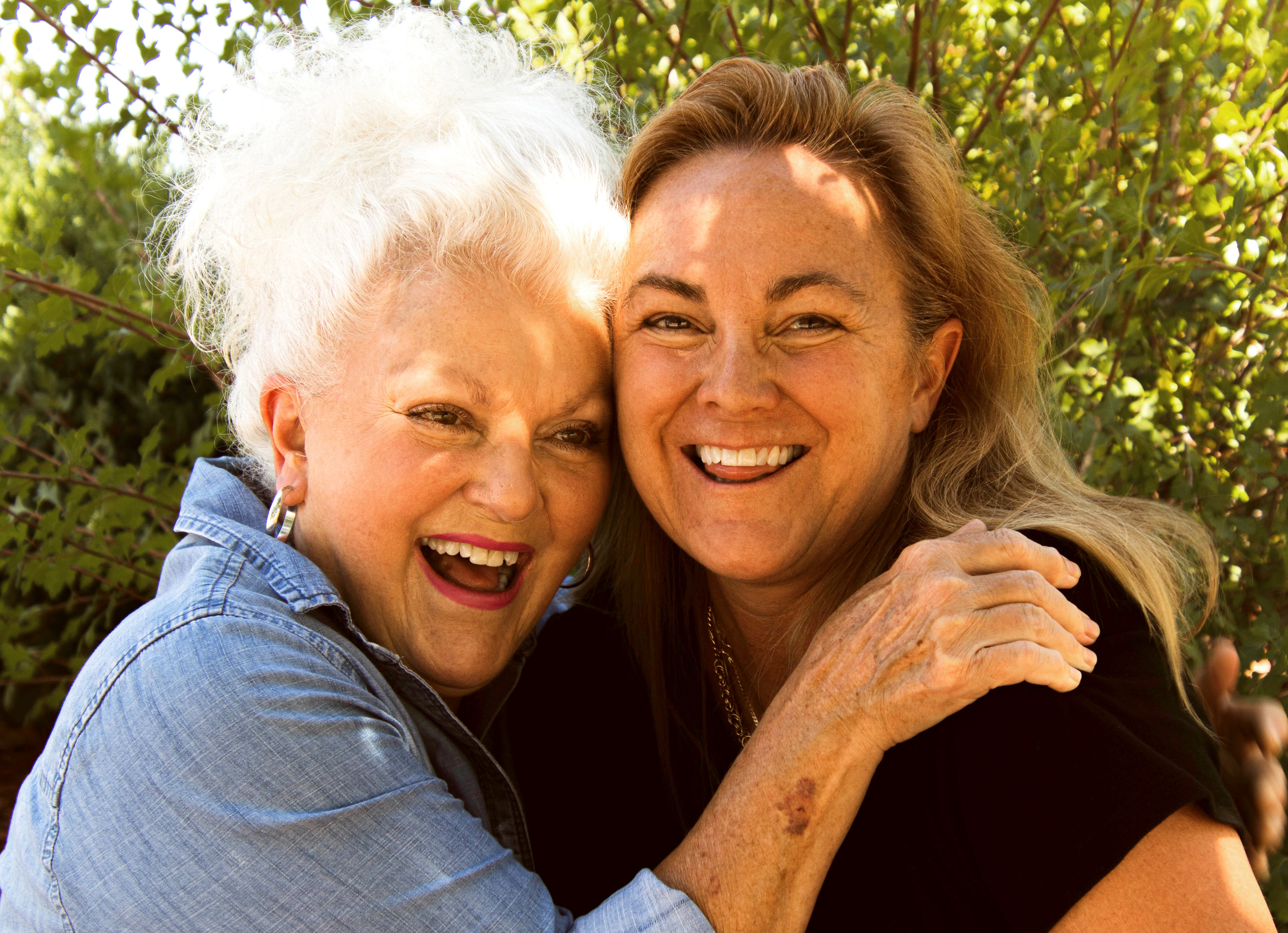
Examples of Shoppers, Any Race, Age, Generally female

User Personas
The average customers are from various economic backgrounds. There were products that could suit the needs of many salary ranges; any customer could go online and find something affordable to their budget. The majority of the customers that did shop at Art.com were female, one of the few distinguishing characteristics. The target shoppers were adults, typically mid-20’s to 60’s.
User Flow & Info Architecture
Creating a feature that integrated with the app involved researching their check-out experience. I wanted editing the customers' photos to be easy and fast. It did help that the Art.com mobile app was already built and available on the app store, so I was able to fill in the existing infrastructure working with the mobile team. The site map below shows the thought process behind how each screen would flow to the next. The fingertip icon indicates when the user would interact with the app to initiate next step in the photo editing process and take them to check-out.
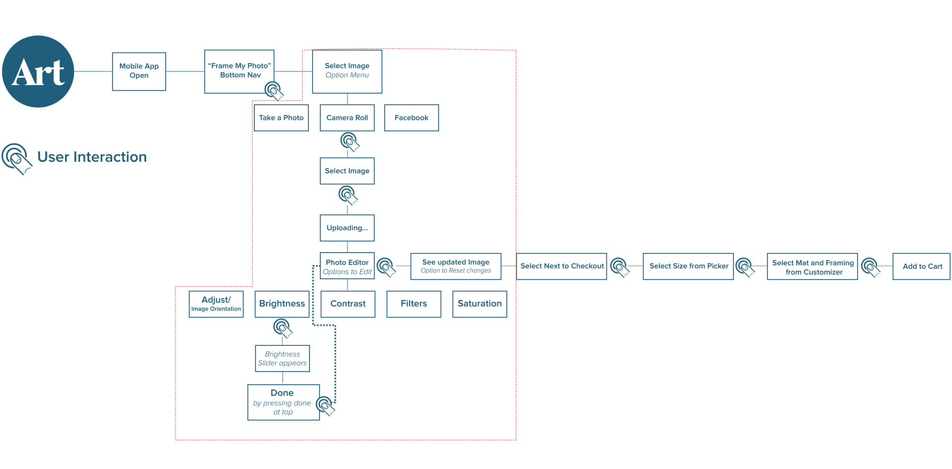
Overall UX flow from opening app to checkout
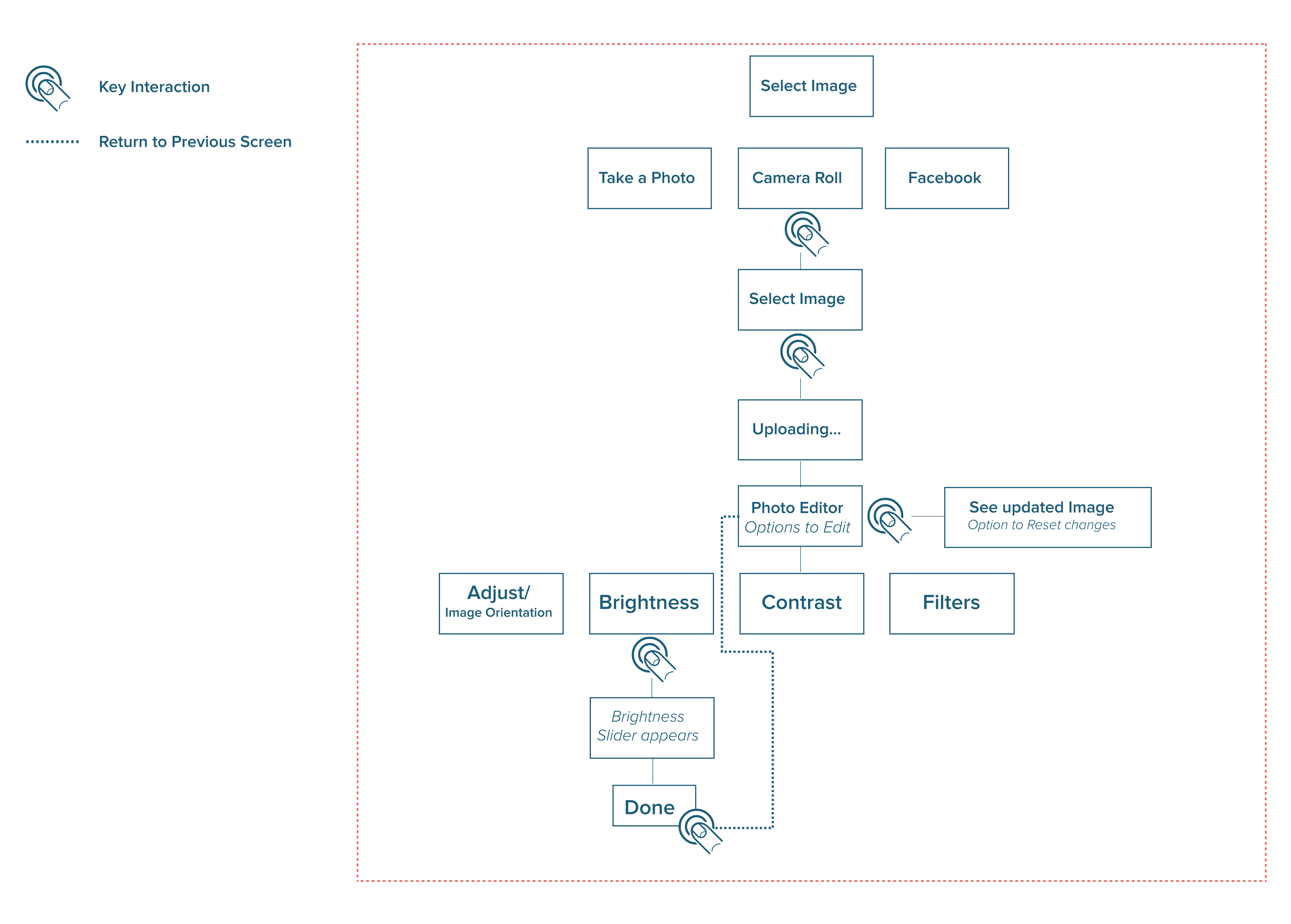
Photo Editor feature I owned for UX
Wireframes
The functionality is as below: upload an image from the camera roll, selecting an image, and making fast adjustments to the image with photo editor sliders before having the user to work with app's framing customizer.
Visual Design
Existing branding and color guidelines were already set in place and as an interim UX designer, my focus was to create the feature within existing guidelines. The photo editor needed to be intuitive and swift to use with UI controls clearly accessible for the photo editor. In subsequent releases, I would have focused on iterating further visual improvements with more refined details. This iteration of visual design was highlighting the editor functionality and how to guide the user in using the interface, with the focus being on the tool set responsive across a range of resolutions on multiple mobile devices.
My solution to these visual problems was to refer to competitive photo editor tools like Instagram and Photoshop. I created tappable icons that would highlight each function under its own icon in a menu strip at the bottom. When it came to consistent design treatment work across the various sizes of devices, I used a tool bar style approach to center all the photo editor features in a concise, central area in the UI when it came to the iPad or tablet format.
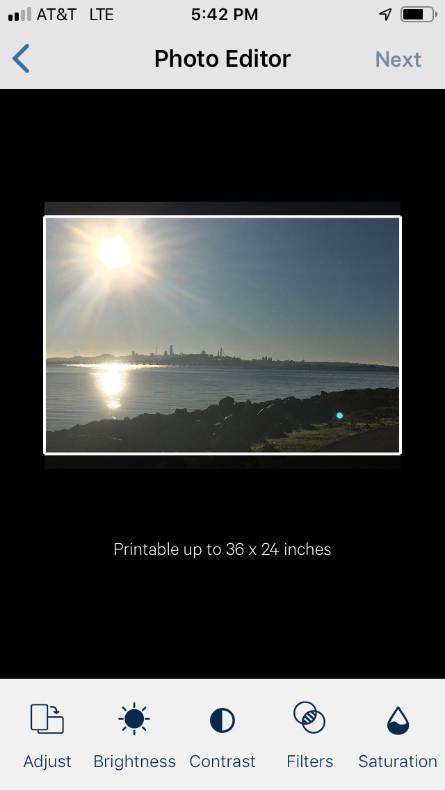
Photo as Selected from Cameral Roll
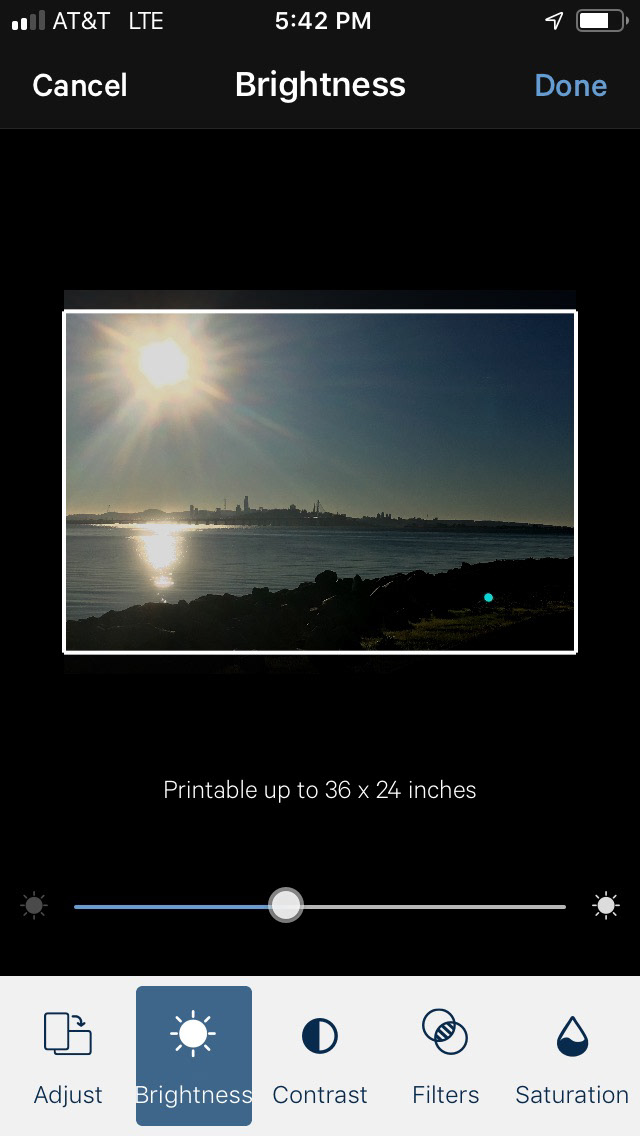
In Photo Editor mode– Brightness
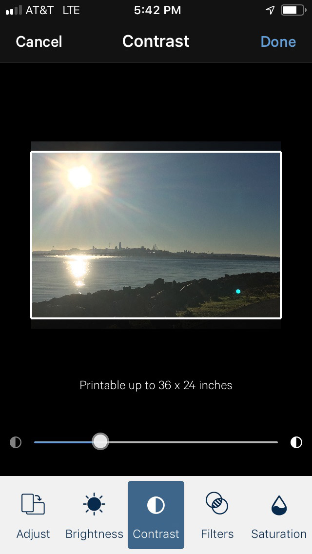
Photo Editor Mode– Contast Adjustment
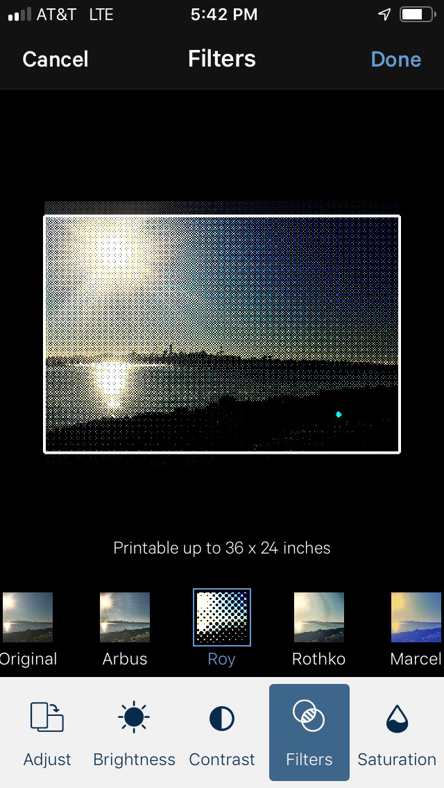
Selecting Filters from bottom Carousel
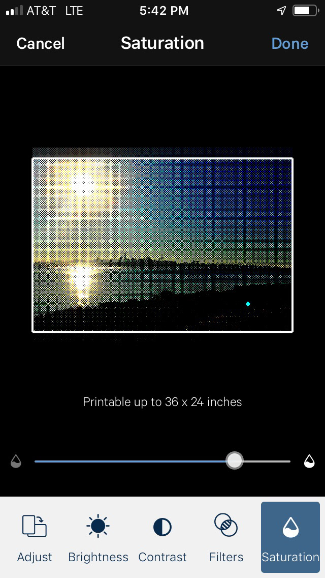
Saturation Adjust Tool
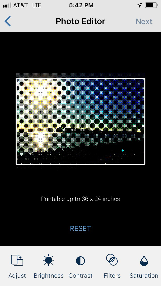
Reset at bottom Clears all Photo edits
Photo Editor tools was custom designed for smallest resolution design of iOS– iPhone 6 SE (1,334x750)
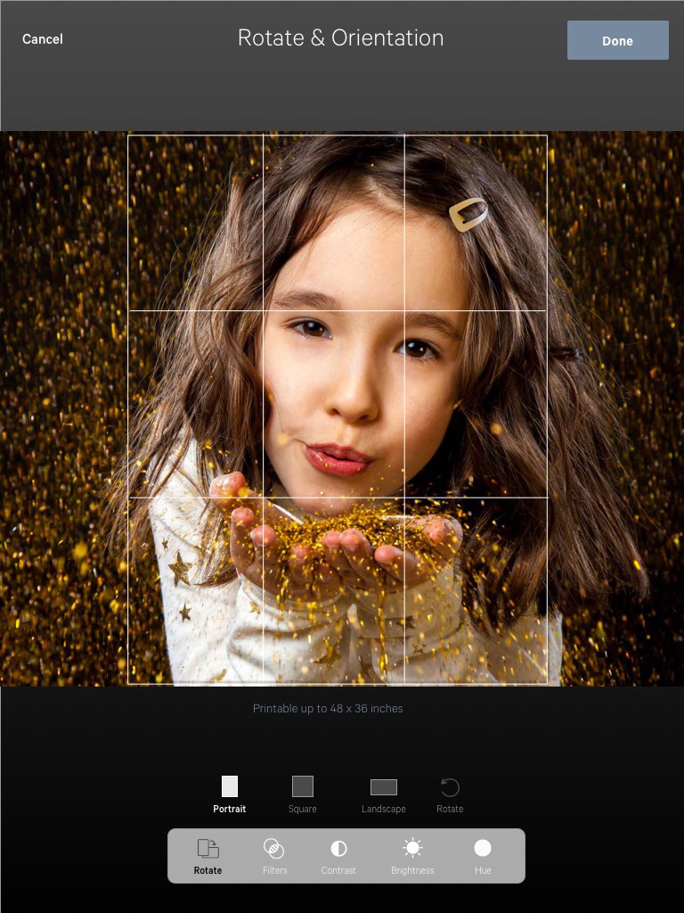
Rotate & Orientation

Contrast control
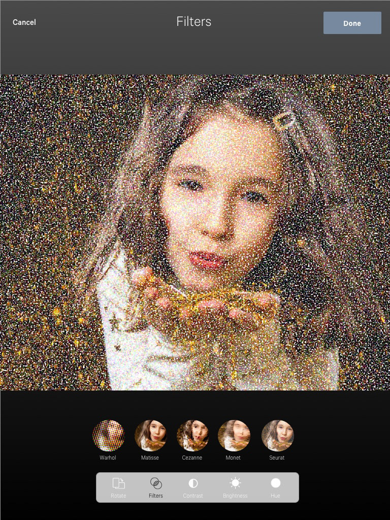
Image Filters at bottom
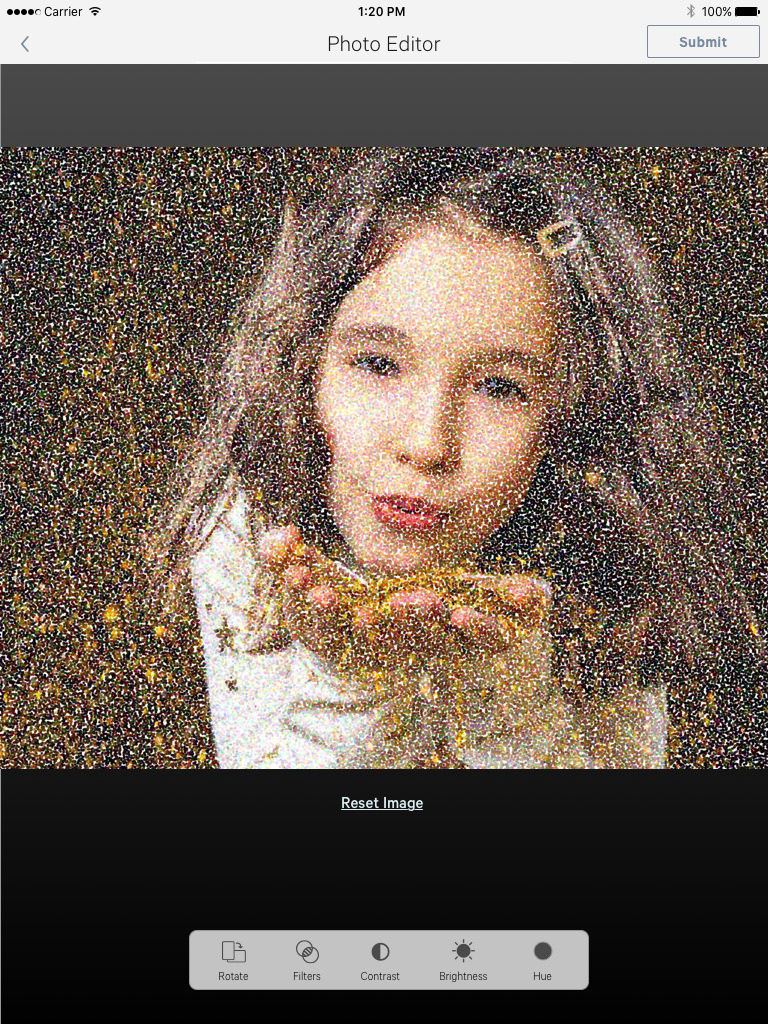
Option to reset image to Default at bottom
Photo Editor tools was also designed for the largest mobile resolution design – iPad (2048×1536)
Prototyping
When initially prototyping for the feature, I worked with InVision and collaborated with design, engineering, and product management with annotations and notes across the prototype. Each note would be taken into further edits and quickly released in a different version for review. For proof-of-concept, I recreated a prototype of just the wireframes in Adobe XD. The UX, animated transitions, and interactions were close to the original prototypes made for the company that ultimately was pushed to their mobile app.
Design Impact
This photo editor feature was released in time to hit the market for Christmas. This was a huge coup since I was brought on in September and there were multiple disruptions for key members within our engineering team. The engineer lead was hauled into jury duty. Another key mobile engineer was held up in China and wasn't permitted to re-enter the USA. The only thing I could do was to keep in communication with both team members to ensure we could still hit our ambitious deadlines. Fortunately, they were as passionate and as interested in the features as I was and we were able to do the first release for our customers in early December.
