Cybersecurity Analytics Design System
Overview
Led the creation of a comprehensive design system for PNNL’s internal cybersecurity application, enabling analysts to efficiently track data anomalies and document security concerns. This system established scalable design standards while navigating complex security protocols and fostering strategic cross-functional collaboration.
Project Timeline
Spring 2025 - Ongoing
Role
Principal Design System Architect & Principal UI Designer
The Challenge
Cybersecurity analysts were working with an inconsistent interface that hindered their ability to quickly assess threats and document findings. The application lacked design standards, creating inefficiencies in a domain where speed and accuracy are mission-critical. Additionally, the development team needed a scalable foundation to rapidly deploy new features without incurring design debt.
Key constraints:
• Sensitive government security requirements (derivative classification protocols)
• Existing purple branding elements to preserve
• Developer preference for shadcn component library
• Need for rapid, scalable development practices
Key constraints:
• Sensitive government security requirements (derivative classification protocols)
• Existing purple branding elements to preserve
• Developer preference for shadcn component library
• Need for rapid, scalable development practices
Strategic Approach
Rather than impose a traditional design-first methodology, I recognized an opportunity to leverage our UI developer's design background as a strategic asset. Early in our collaboration, we spent significant time deliberating how to integrate shadcn/ui - a modern React component library - into my design approach.
• Accelerate implementation through shared design-dev vocabulary
• Build crucial cross-functional trust through flexibility and compromise around our defined technical constraints
• Establish sustainable practices leveraging shadcn/ui's composable interface for future team members
• Navigate security constraints while maintaining design quality within the library's framework
Design System Architecture
Atomic Design Methodology
I structured the system using atomic design principles, a methodology created by Brad Frost that organizes interface components like a chemistry system. Think atoms (basic elements like buttons), molecules (simple groups like search forms), and organisms (complex sections like navigation headers). This approach made perfect sense for our cybersecurity application because analysts deal with incredibly complex data workflows - they needed consistency they could rely on during high-stakes threat assessments.
Early on while talking with a developer, I realized that sticking to rigid design terminology was creating unnecessary friction with our development team. Instead of digging in my heels, I decided to speak their language. "Tokens" instead of "colors," "spacing" instead of "padding/margins" - whatever worked for them worked for me. This took roughly a 2 hour call where we pulled in an additional designer for an advocate for design and a unified system but it yielded good results for our development and design strategy. By adopting their vocabulary, I gained insight into their technical constraints and opportunities like when they explained how certain spacing values translated efficiently to their code base. Plus, our iteration cycles got way faster - instead of spending time translating design intent, we could focus on solving actual user problems and how it related to unique needs to the components. The result? We eliminated the typical design-handoff friction and accelerated our delivery timeline significantly by using resources like open source shadcn and revising a consistent design language when it came to sizing and colors.
Design Tokens - Strategic Color Decisions
• I preserved brand equity by maintaining existing purple header element
• I embraced restraint given the cybersecurity content sensitivity - a limited palette prevents information hierarchy confusion during critical security assessments
• I selected shadcn compatibility to streamline developer implementation while maintaining design control
• I established semantic color roles (error, informational) for consistent user mental models
Typography - Scalability Focus
Selected Noto Sans from Google Fonts for:
• Universal accessibility across development environments
• Comprehensive weight/style variations supporting complex information hierarchy
• Proven legibility in high-stakes analytical contexts
• Long-term maintenance simplicity
• Universal accessibility across development environments
• Comprehensive weight/style variations supporting complex information hierarchy
• Proven legibility in high-stakes analytical contexts
• Long-term maintenance simplicity
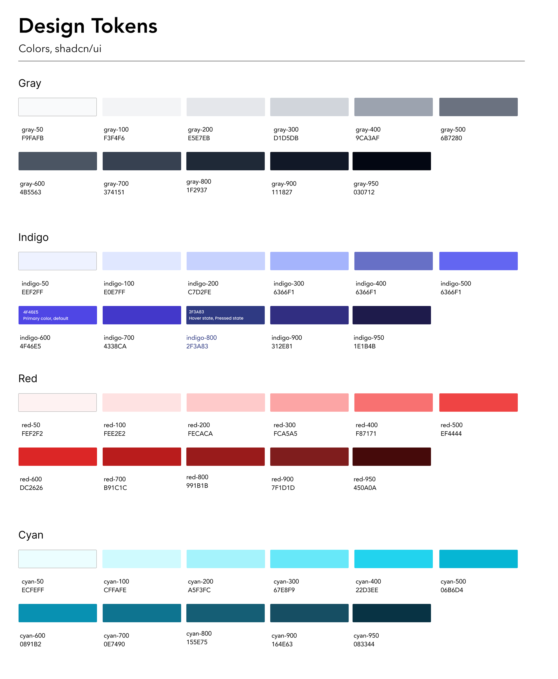
Design tokens for our color library used by development, these were taken from open source development library https://ui.shadcn.com
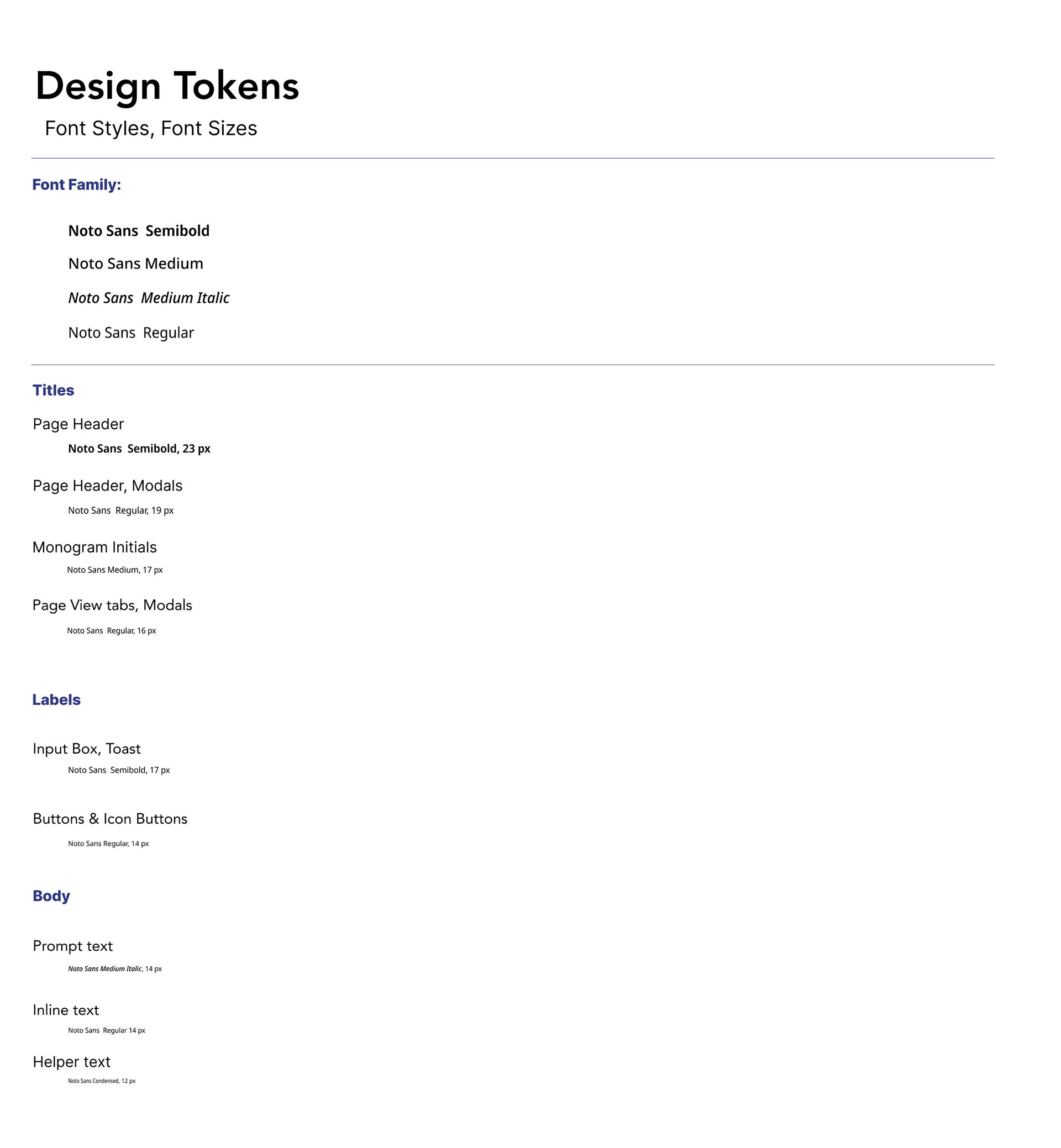
Noto Sans was selected for its wide range of weights and flexibility in web and screen based applications
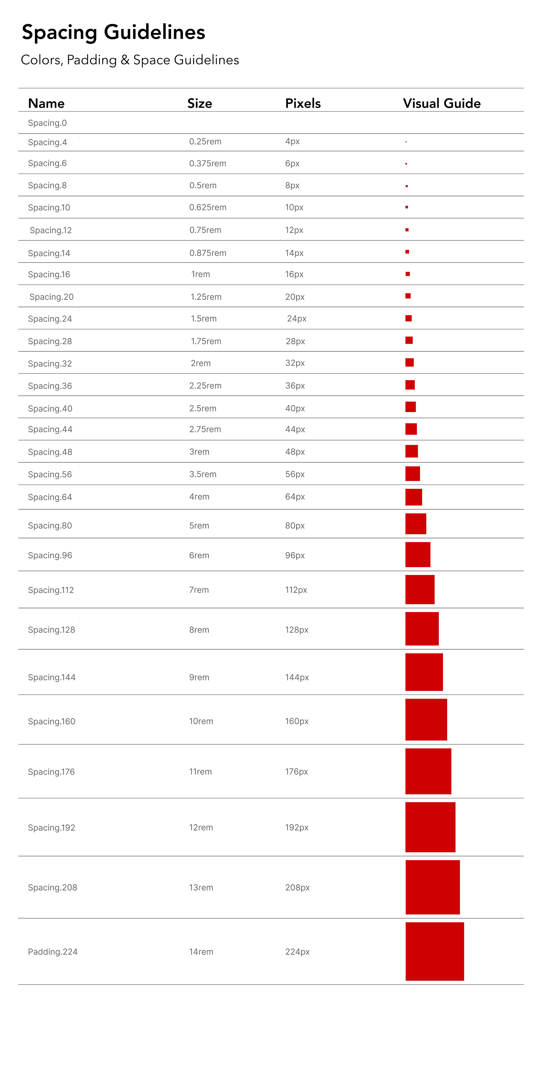
Established a simple system that shows how each spacing size works in both rem units (what developers use) and pixel values (what designers see), with visual examples to help anyone joining the project understand how spacing should be applied consistently.
Key Components & Strategic Decisions
Molecule – Input Box: I designed comprehensive text area states to support the complex data entry workflows cybersecurity analysts navigate. I used visual hierarchy with simple and recognizable UI patterns - analysts needed immediate feedback when using their input boxes during critical security assessments.
Key design decisions:
• State differentiation through subtle color shifts
Active state uses indigo-600 stroke to provide clear focus indication without overwhelming the sensitive security data context
• Consistent 34px height specification:
Established after analyzing existing UI constraints and maximum content requirements across the application
• Typography hierarchy:
Noto Sans Display Medium Italic for labels creates clear visual separation from input content while maintaining system consistency
• Accessibility considerations:
High contrast ratios maintained across all states, with particular attention to disabled state legibility
This component required extensive collaboration with development to ensure all state transitions functioned properly within the shadcn framework while meeting our design system's semantic color guidelines.
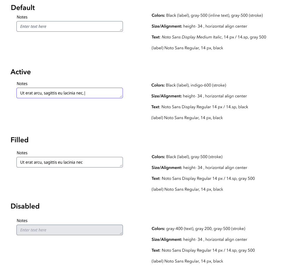
We settled on four different states that would define the text area's requirements.
Molecule– Button System
Architected a comprehensive button hierarchy addressing the complex interaction needs of cybersecurity workflows. The extensive variation requirements emerged from user research revealing that analysts needed distinct visual cues for different action criticality levels during threat assessment processes.
Strategic design approach:
• Four semantic button types: Primary (critical actions), Secondary (common actions), Ghost (subtle interactions), and Destructive (high-risk actions like data deletion)
Strategic design approach:
• Four semantic button types: Primary (critical actions), Secondary (common actions), Ghost (subtle interactions), and Destructive (high-risk actions like data deletion)
• Complete state system: Each type includes Default, Hover, Pressed, Disabled, and Loading states to provide consistent user feedback across all application contexts
• Icon integration capability: Recognizing that security interfaces often require symbolic communication for rapid comprehension
Spacing and sizing consistency: 16px baseline spacing system ensures predictable layout behavior across diverse page contexts
The challenge was creating enough variation to support complex workflows while maintaining visual coherence. Development partnership was crucial - each state required careful consideration of shadcn implementation constraints while preserving design intent.
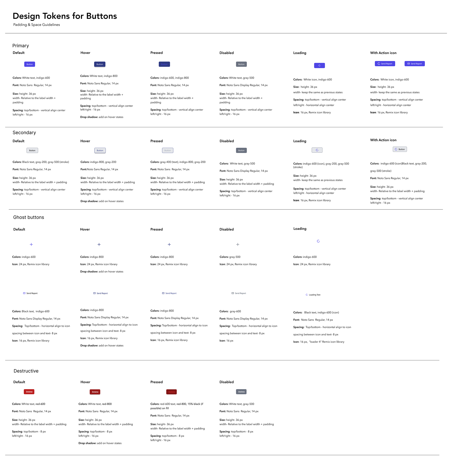
I created four main styles of buttons with the expected states of interactive buttons
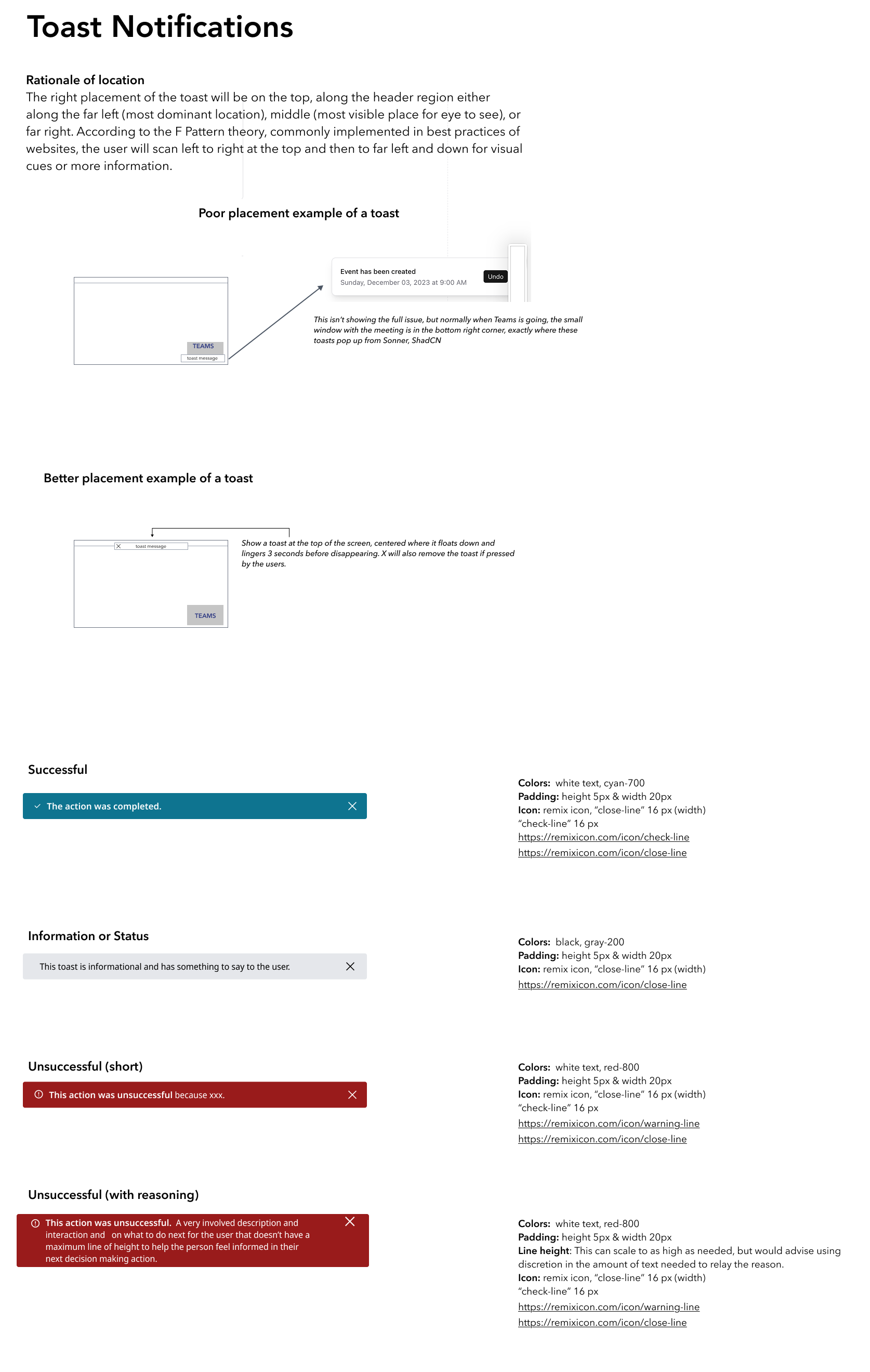
Molecule– Toast Notifications
Designed a comprehensive toast notification system that prioritized analyst workflow efficiency over conventional design patterns. Given the critical nature of cybersecurity alerts, toast placement and behavior required careful consideration of both user attention patterns and the analysts’ typical desktop environment.
Strategic placement decisions:
Applied F-pattern scanning research to optimize notification visibility. Since users naturally scan left-to-right across the top of interfaces before moving down the left side, I positioned toasts along the header region with three placement options: far left, center, and far right. This top placement ensures notifications appear within users’ primary scanning zone during active threat analysis.
Applied F-pattern scanning research to optimize notification visibility. Since users naturally scan left-to-right across the top of interfaces before moving down the left side, I positioned toasts along the header region with three placement options: far left, center, and far right. This top placement ensures notifications appear within users’ primary scanning zone during active threat analysis.
Environmental context considerations:
Through user research, I discovered that Microsoft notifications consistently blocked the industry-standard bottom-right placement. Analysts’ desktops are constantly populated with Microsoft ecosystem alerts - Teams messages, Outlook reminders, email notifications, and system updates - creating critical visibility conflicts where our toast notifications could be completely obscured. By moving notifications to the top, we eliminated this interference and ensured our application’s toast notifications remained visible regardless of what Microsoft applications were running during threat analysis sessions
Through user research, I discovered that Microsoft notifications consistently blocked the industry-standard bottom-right placement. Analysts’ desktops are constantly populated with Microsoft ecosystem alerts - Teams messages, Outlook reminders, email notifications, and system updates - creating critical visibility conflicts where our toast notifications could be completely obscured. By moving notifications to the top, we eliminated this interference and ensured our application’s toast notifications remained visible regardless of what Microsoft applications were running during threat analysis sessions
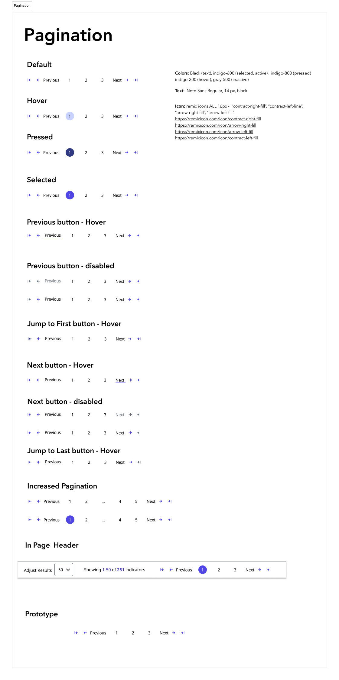
Organism– Pagination
User workflow context:
Cybersecurity analysts use pagination primarily when searching through their reports - reviewing numerous documented findings during investigations. When searching for specific reports or patterns across their documentation, analysts need to quickly navigate through extensive search results, compare information across multiple pages, and efficiently locate relevant materials. Traditional pagination workflows would significantly slow down these critical research and review processes.
Cybersecurity analysts use pagination primarily when searching through their reports - reviewing numerous documented findings during investigations. When searching for specific reports or patterns across their documentation, analysts need to quickly navigate through extensive search results, compare information across multiple pages, and efficiently locate relevant materials. Traditional pagination workflows would significantly slow down these critical research and review processes.
User research-driven decisions
Top placement strategy: Analyst manager feedback revealed that traditional bottom pagination created inefficient scrolling during rapid threat assessment workflows
Comprehensive state coverage: Designed hover, pressed, selected, and disabled states for all navigation elements to provide clear wayfinding during data analysis
Enhanced navigation options: Included “Jump to First” and “Jump to Last” functionality for large dataset navigation - critical when analysts review extensive pages
Scalable architecture: “Increased Pagination” variant accommodates datasets with hundreds of results pages
Technical collaboration highlights
• Worked with development team to ensure all interactive states functioned within existing data loading architecture
• Icon sourcing from Remix icons for consistent visual language
• Color token implementation using established color system developed earlier in our collaboration
Results/Impact
I successfully managed derivative classification (DC) review process, collaborating with security specialists to ensure public portfolio compliance while protecting sensitive methodologies, while shipping components as the lead designer on this long running application. This demonstrated ability to balance transparency with security requirements - essential for enterprise design leadership- along with the design and development needs for the product.
Built a Strong Foundation
Created a design system that makes it easy for the team to build new features consistently. Through close collaboration with development, I was able to integrate components from an open source development library (shadcn/ui) that ensures the system will be sustainable over time.
Collaborated effectively with a developer who brought valuable design experience from their previous role, embracing their technical perspective and adapting to development-friendly terminology. The system works well for both designers and developers, making future work much smoother.
Delivered Custom Solutions Based on User Research
Integrated direct feedback from the analyst manager to make design decisions tailored to their unique operational requirements. Rather than following standard design patterns, I prioritized the analysts’ specific workflow needs - like placing pagination at the top instead of the bottom so they could navigate through reports quickly without scrolling during time-sensitive investigations.
Integrated direct feedback from the analyst manager to make design decisions tailored to their unique operational requirements. Rather than following standard design patterns, I prioritized the analysts’ specific workflow needs - like placing pagination at the top instead of the bottom so they could navigate through reports quickly without scrolling during time-sensitive investigations.